什么是圣杯布局
圣杯布局是一种包括页眉、页脚和一个包含两个左右边栏的主内容区的网页布局。其布局遵循以下规则:
- 有固定宽度侧边栏和自适应内容区域
- 中间一列应该是最先出现,早于两个侧边栏
- 不管三列中包含的是什么,都应该具有相同的高度
实现方式
DOM 结构,其中左侧宽度为200px,右侧宽度为150px,中间宽度自适应
1 | <div id="header">header</div> |
CSS
1 | body { |
实现步骤
第一步:创建框架
首先创建id 为header、container、footer 的三个div,同时在container 中添加id 为center、left、right 的三个div
1 | <div id="header">header</div> |
第二步:使主内容区自适应
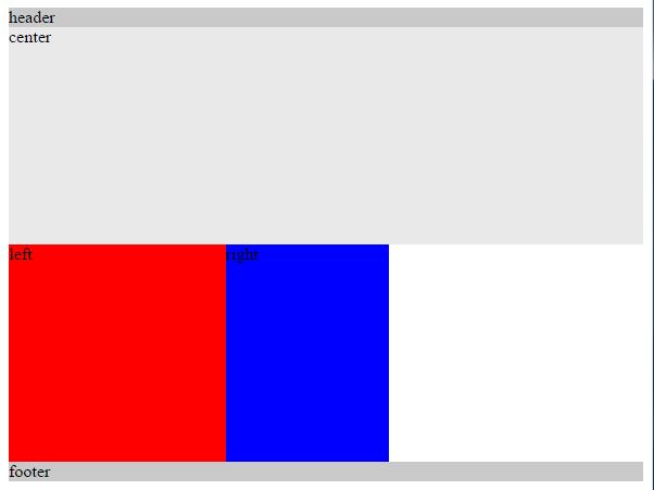
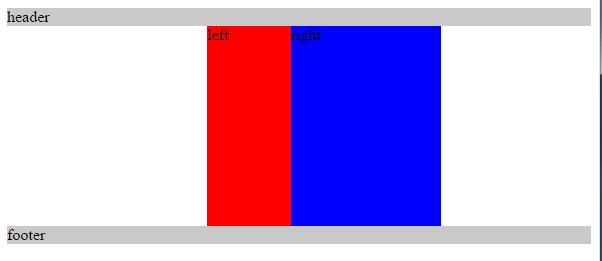
为了使主内容区(center)自适应,设置宽度为100%,同时需要设置center、left、right 为向左浮动,此时left 和right 没有在相应的位置上, 同时为footer 设置clear: both 清除浮动带来的影响
1 | #container .column { |
看上去这样
第三步:设置左侧栏到正确位置
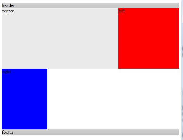
设置左侧栏(left)为负外边距margin: -200px 其宽度为左侧栏自身的宽度width:200px
1 | #left { |
看上去这样
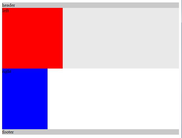
此时left 同center 重叠(overlay)那么如果设置left 的负外边距margin: -100%; 其值为container 的宽度width: 100%,left 就会移动到对应的位置
1 | #left { |
看上去这样
第四步:设置右侧栏到正确位置
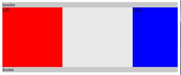
按照上一步过程,只要设置右侧栏(right)为负外边距margin: -150px 其宽度为右侧栏自身的宽度width:150px,此时右侧栏(right)就处于正确位置了
1 | #right { |
看上去这样
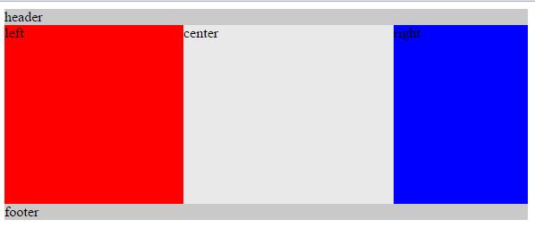
第五步:正确设置中间栏
此时中间栏(center)被左右俩栏(left、center)覆盖了(overlay),就需要给外层(container)设置内边距(padding )将左右俩栏的位置空出,其大小分别为左右俩栏(left、center)各自的宽度
1 | #container { |
看上去这样
然而此时左右俩栏(left、center)也锁了进来,于是需要采取相对定位方法(position: relative;),各自相对于自己把自己挪出去
1 | #container .column { |
看上去这样
第六步:缩放窗口
对窗口进行搜索,当center 的宽度width 小于left 的宽度时,布局将会出现问题,为此需要设置body 的最小宽度(min-width)为2 倍的左侧栏(left)的宽度(width)加上右侧栏(right)的宽度(width)。
1 | body { |